The redesign journey that aimed to simplify the online donation process. Our focus was trimming the unnecessary and optimising the essential. This wasn’t just about saving time; it was about making it easier to contribute to meaningful causes.
The challenge
When donating online, there’s a bunch of required details—name, address, tax info, email— which can be a bit overwhelming. While necessary, we wondered: Can we make this simpler?
Our project’s focus was to find ways to gather essential donor information with less fuss. We wanted to streamline the donation process to make it easy for donors to complete their generous contributions.
Streamlining donations for users so they can make quicker donations, while the BHF can receive all data needed for donations to be processed according to legal requirements.
Design process
This is the design process I followed for this particular project. I’ll touch on the key parts from each phase to give a flavour of how this project developed over time.
Design process
Discovery
The donation form was carefully audited during our discovery process, using the collected data to find ways to improve the form. We looked at every part of it to make sure nothing was missed! Session recordings, surveys, usability testing and Google Analytics data was at our disposal.
Session recordings
Based on the session recordings, these were the most common errors that were picked up. This illuminated some of the components that weren’t functioning optimally on certain steps. This gave us some insight into steps causing issues, and gave us some issues that we could look to explore to reduce friction in the donation process.
Session recordings showing most common user errors
Heuristic analysis
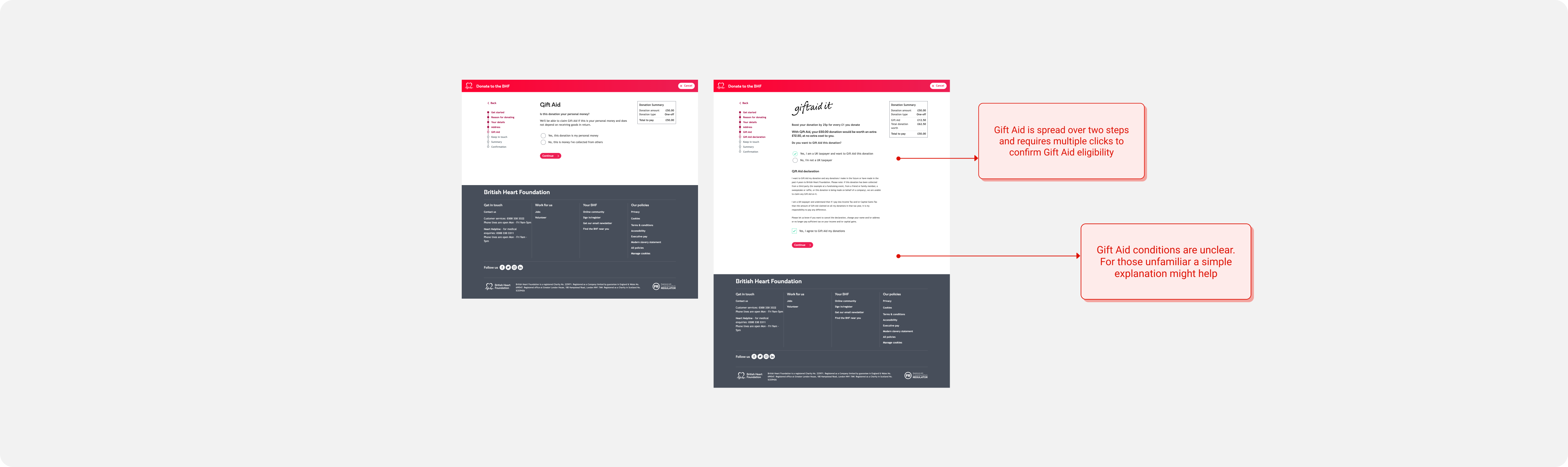
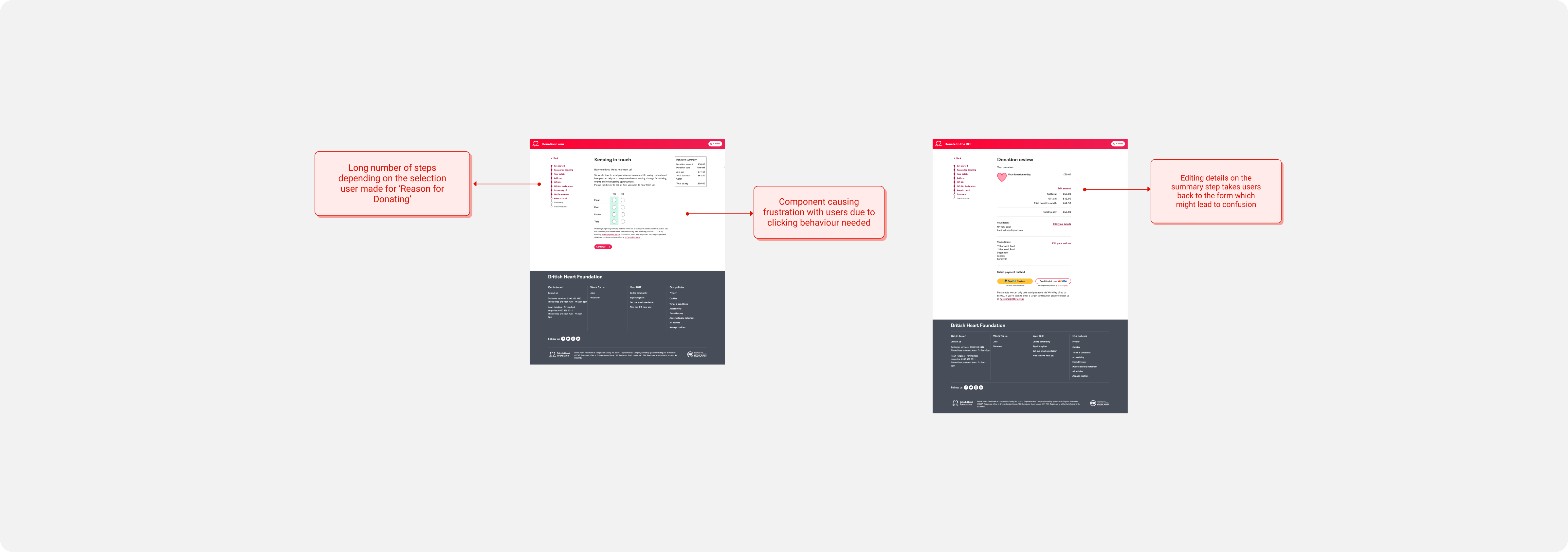
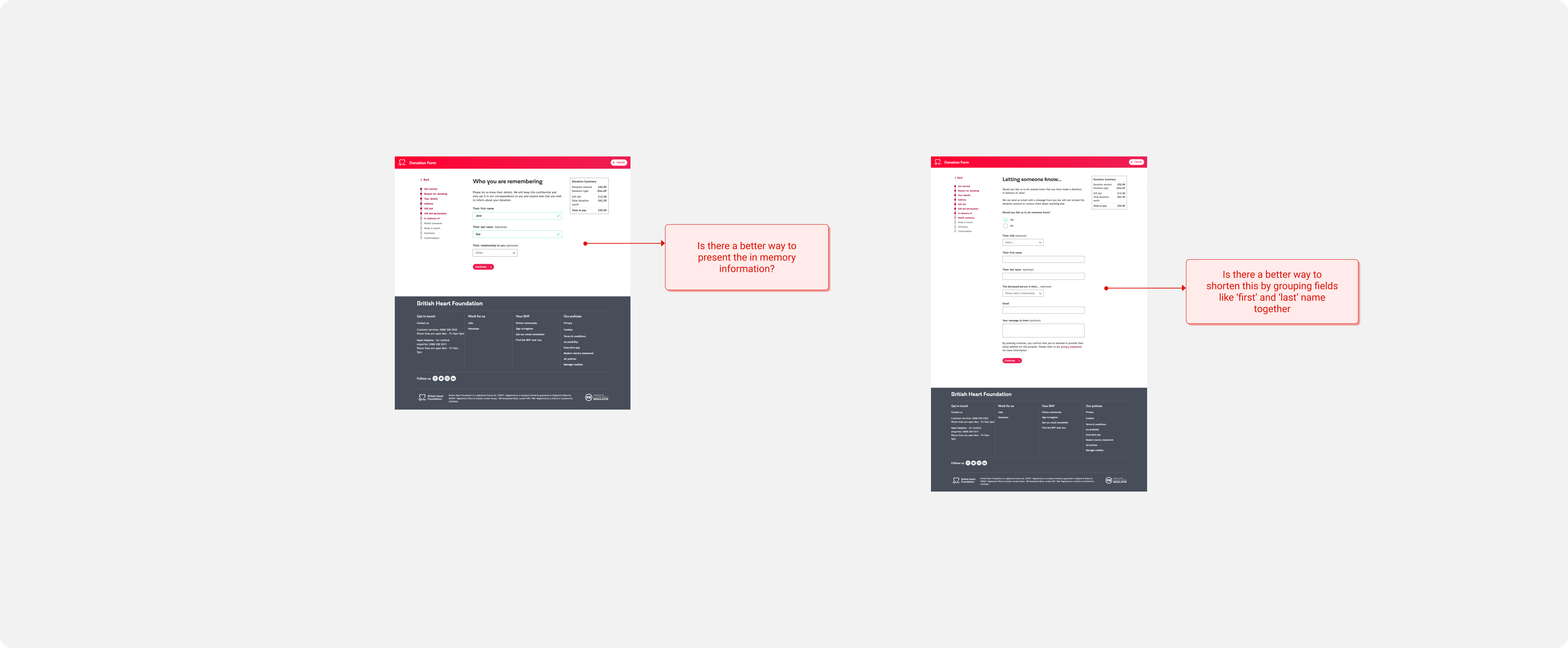
Next up, I performed a heuristic analysis to pinpoint opportunities for enhancing the existing donation form. I took a deep dive into the form, wearing the hat of a potential user to spot any potential stumbling blocks. Since I was still fresh in my role during this exploration, it provided me with an objective perspective. I wasn’t so accustomed to the form that I overlooked certain issues.
Heuristic analysis of steps requesting user personal details
Heuristic analysis of steps requesting Gift Aid details
Heuristic analysis of the step requesting users' communication preferences and the summary step
Heuristic analysis of summary step which allows users of users who wanted to include 'donation in memory of..' details
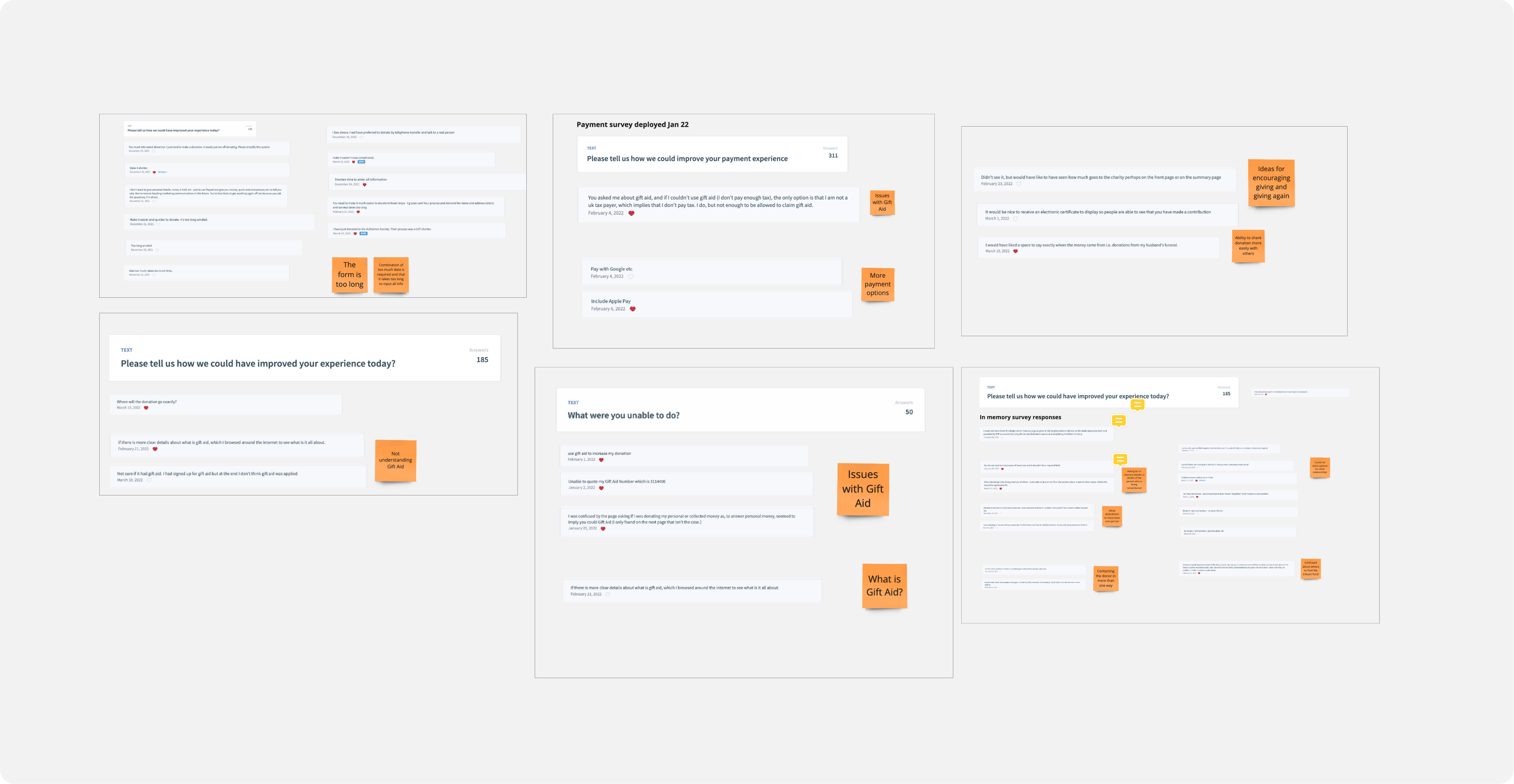
Surveys
Multiple surveys had been deployed on the site over the course of a few months and before we started getting into the design phase. Some of these surveys were related to garnering general feedback and some were related to exploring future improvements of the form e.g introducing new payment types.
These are some of the comments that people left on the surveys completed. Overall, the experience of those completing the form was positive with over 90% of respondents rating the form an 8+ out of 10 (excellent).
User feedback from surveys on donation form
Key items users were giving negative feedback about, in priority order
Business influence
Faced with a critical business need, a strategic initiative was kicked off to revamp the checkout experience. Our focus was to streamline the process with the main aim to make donating a breeze for our valued contributors. So, we prioritized speeding up and simplifying the donation form, consciously putting other tweaks on hold to ensure a straightforward and efficient donation experience.
Stakeholder workshop
To kick-off this strategic initiative, the product manager and I held a workshop with stakeholders who had subject matter expertise on the donation form. This included a Gift Aid manager, CRM executives and fundraising executives.
We focused the workshop to answer the following questions:
1. Which data is crucial?
2. How is the data used?
3. Who owns the data?
4. Can the information be collected more effectively?
Stakeholder workshop activity
During this workshop, we asked key stakeholders to consider the questions listed above. We created a key so each stakeholder type could annotate the ‘donate money’ user flow (pictured below) with the data requirements relevant to them. We used Miro, which is a great tool for holding workshops remotely!
We then discussed these data requirements and used these insights to think of ways shorten the form.
Workshop materials - Miro board containing the donation user flow, questions and sticky notes for comments
Data requirements
The following requirements were as follows (apart from payment amount and payment frequency i.e monthly or one-off):
1. Name
2. Address
3. Email address
4. Taxpayer status
5. Reason for donating
5. Communication preferences
Define
How might we?
While it was very clear that the business set the initiative to focus on shortening the donation form, there were still some design problems to contend with. The problem being…how can we collect all the required data whilst shortening the donation form?
How might we shorten the donation form while still collecting all the relevant data for donation processing?
Ideate
When shortening the form, there were many, many iterations that were done and I received feedback on them from a wide range of stakeholders. Taking the feedback on board and thinking about future testing – these were the designs that I wanted to stress test.
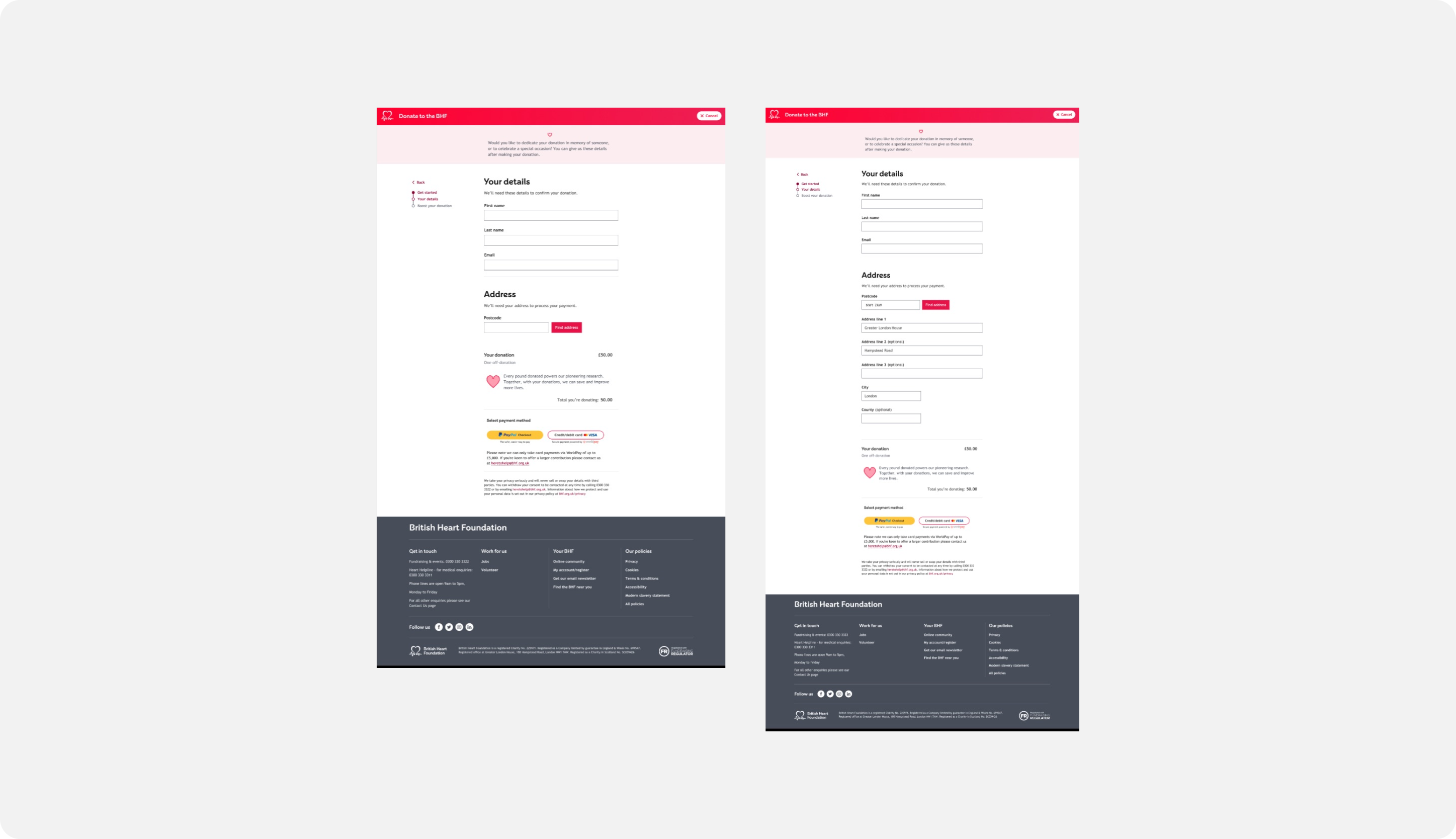
There are two versions of what I’ll now be referring to as the ‘short form’. A dynamic version where progressive disclosure is taken advantage of to request user information. There is a paymentupfront versionwhere essential information is requested for payment, and additional details are requested afterward.
Payment upfront form - Essential details first for payment, additional details after
Dynamic form - All information requested before payment, using progressive disclosure
Validate
After creating the interactive prototypes, I devised a testing plan to garner some feedback.
The test:
A moderated usability testing plan to gather qualitative feedback
Six users (three ‘cold’ testers and three ‘warm’ testers)
Mixture of task and questions
Following the testing, I grouped all the user feedback into affinity maps and used categories to identify the type of feedback: pain points and general observations.
Affinity mapping for usability testing feedback
Then, using the affinity mapping insights I condensed the feedback into high level findings to see it at a glance.
High level findings for moderated usability test
Testing conclusions & next steps
The testing results were quite mixed and there were some helpful insights that would be considered in further iterations of the form. And eventually, were taken on board and informed new iterations.
As a result, following the feedback and stakeholder preference: the payment upfront form was selected as for the donation form redesign.
I took aspects of both designs of the form and used that to inform the designs to take into the ‘develop’ phase.
Develop
Entering the ‘develop’ phase feels great, even though your designs have been heavily interrogated (probably) up until this point, they’ve made it through to the final stage.
During this phase, it was all about ensuring the screens were in tip-top shape to be deployed to the live site.
The designs were deployed as a staggered A/B test starting at 10% and eventually rising up to 50%.
Below, are some of the pages with key changes.
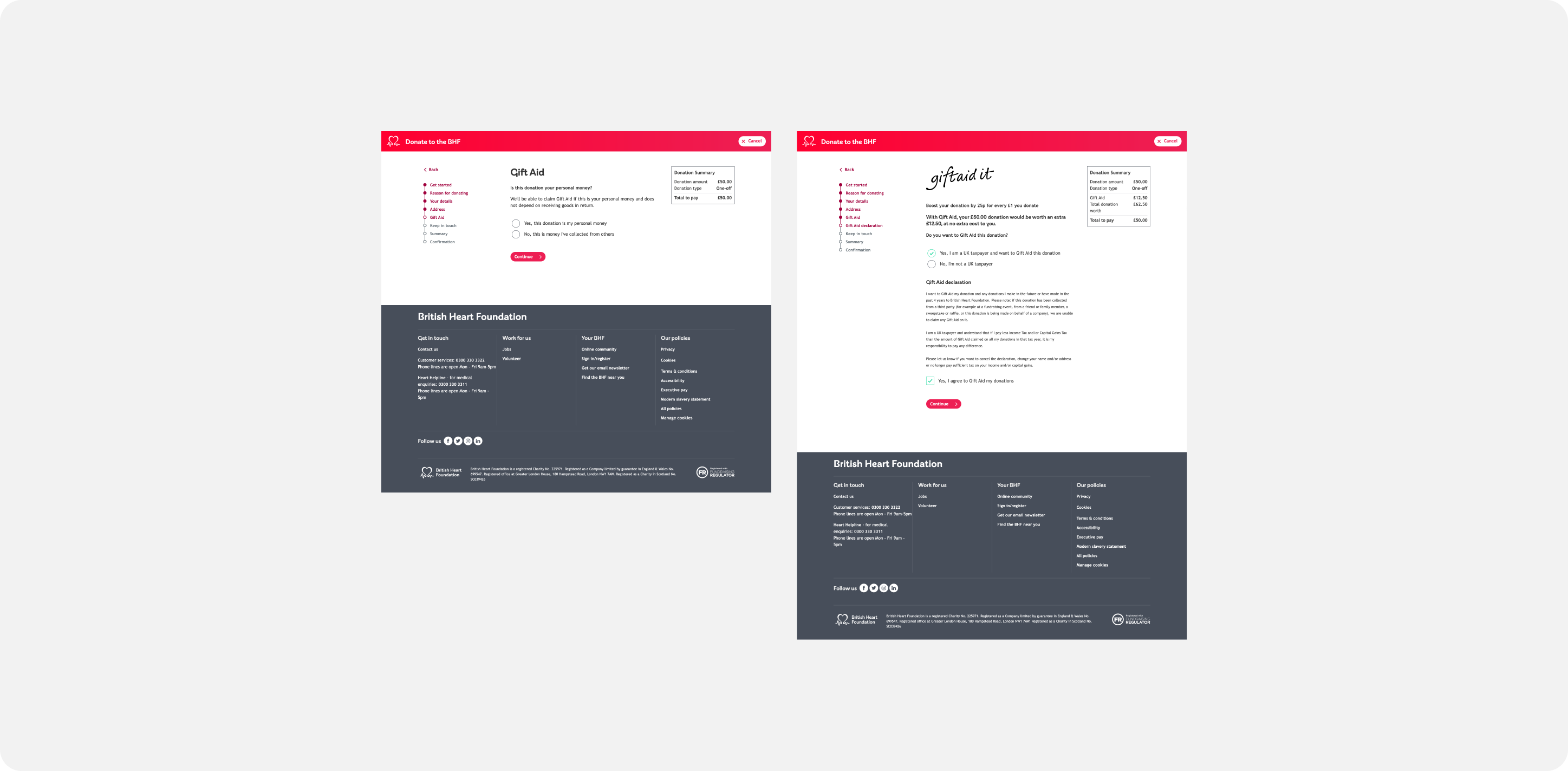
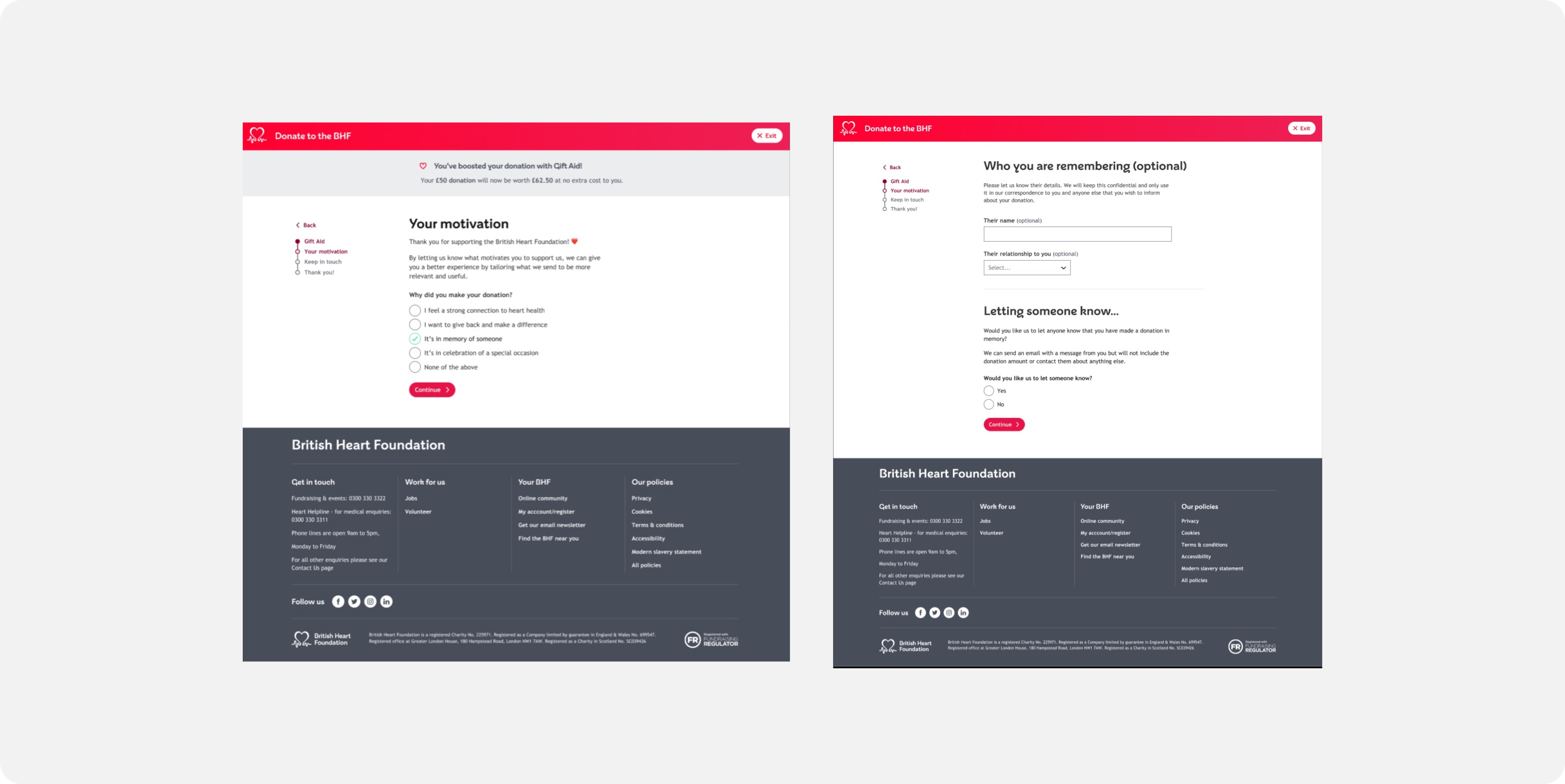
Gift Aid - Before
How Gift Aid was presented to users in original form - a two step process and three ticks required at maximum
Gift Aid - After
How Gift Aid was presented to users in updated 'short' form - a one step process with progressive disclosure applied
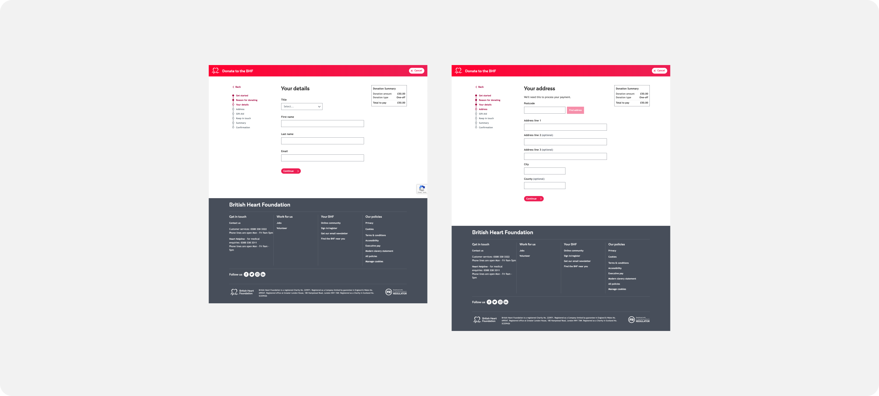
Personal details - Before
How personal details and address was requested previously - a lot of fields and cognitive overwhelm
Personal details - After
How personal details and address was requested in updated 'short' form - a one step process where fields are only shown when needed
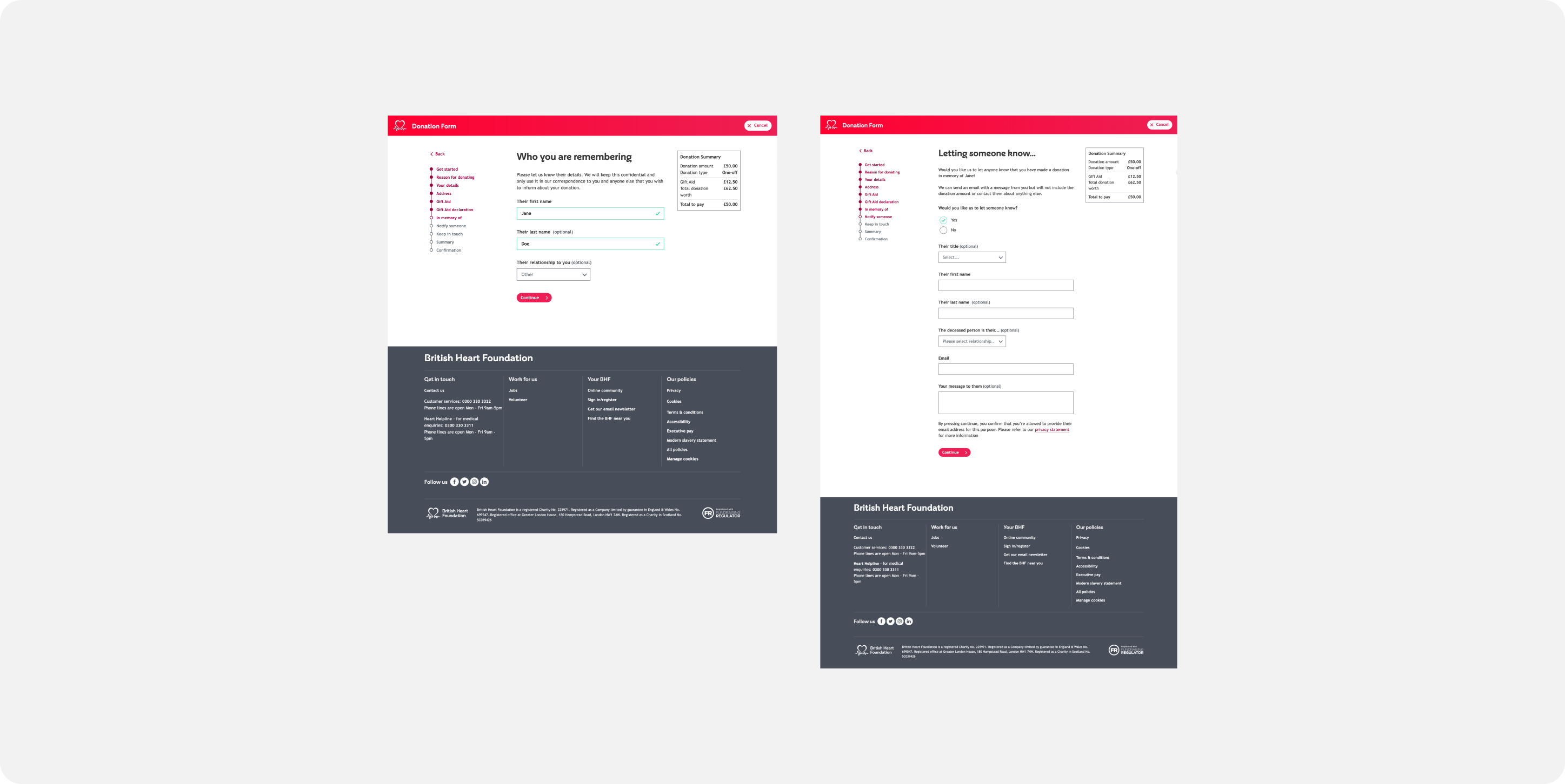
In memory details - Before
How in memory details were requested previously - Required fields for personal information like 'First name' for the person being remembered
In memory details - After
How in memory details were requested in updated 'short' form - No personal details of the person being remembered are required. All details are optional.
Results
We tested a donation form gradually, starting at 10% exposure and scaling up to 50%.
By streamlining the steps from 12 (maximum) to 7 (maximum), we saw a 4% increase in overall donations (monthly & one-off) for the 50% test group.
These insights were eventually incorporated into a comprehensive redesign of the entire form, including improvements to Gift Aid and the ‘in memory’ question in the donation form.
Lessons learned
In concluding this project, we successfully navigated the complexities of a multifaceted form.
Balancing the needs of diverse stakeholders and streamlining intricate processes, we made strategic decisions and compromises, especially in collaboration with developers and stakeholders regarding Gift Aid integration.
This phase underscored our commitment to finding efficient and user-centric solutions amid various challenges.
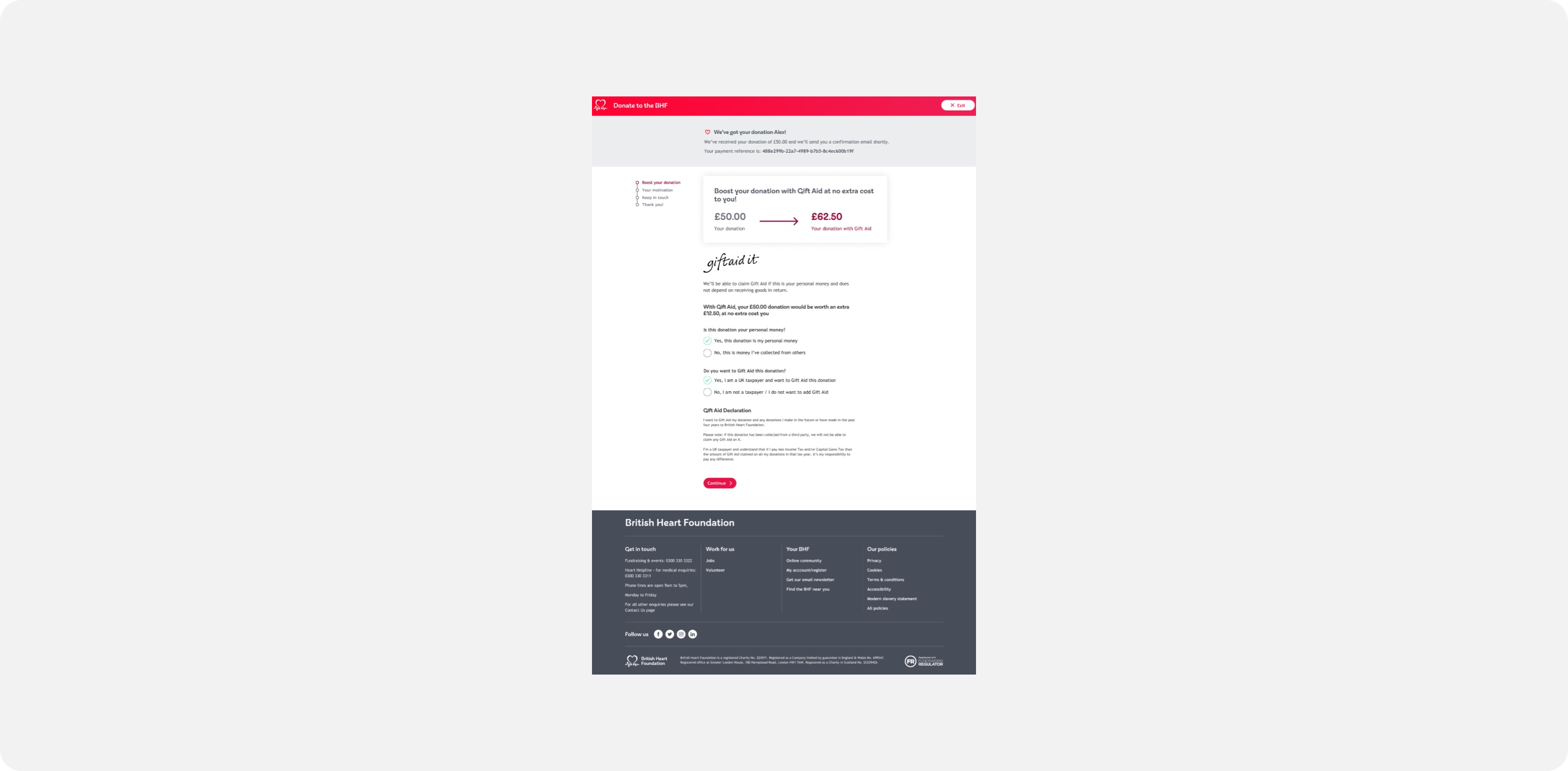
The final prototype
Position
UX Designer
Tools
Miro, Figma
Timeline
4 months
Team
Product manager, scrum team incl. QA, back and front-end developers, business analyst, business stakeholders