Introducing a bespoke feature equipped with a quality validator, ensuring that only items in prime condition find their way to those in need. Donors can declutter their space seamlessly while championing a cause—making a positive impact on life-changing research.
Introducing a bespoke feature equipped with a quality validator, ensuring that only items in prime condition find their way to those in need. Donors can declutter their space seamlessly while championing a cause—making a positive impact on life-changing research.
The challenge
The challenge
Donating items online is an excellent way to both contribute to a worthy cause and tidy up your living area. Yet, it can pose a bit of a challenge, particularly if you’re unsure about what items are acceptable for donation.
The BHF has been grappling with this recurring problem in the donation collection service. Many times, well-meaning donors submit items online only to become disheartened when informed that their donation doesn’t meet the necessary criteria.
This project sought to extract what these standards are from store managers and translate this into a simple, easy to understand step in the online collections form.
Both users and the business are dealing with a frustrating experience due to inadequate communication of item donation standards. This results in the BHF wasting time and money pursuing collections for substandard items and having to decline items at the donors property. This leads to frustration for both parties.
Both users and the business are dealing with a frustrating experience due to inadequate communication of item donation standards. This results in the BHF wasting time and money pursuing collections for substandard items and having to decline items at the donors property. This leads to frustration for both parties.
Design process
Design process
Design processes come in different shapes and sizes, and this is the bespoke process I thought would suit this project.
Design processes come in different shapes and sizes, and this is the bespoke process I thought would suit this project.
The design process chosen for this project
The design process chosen for this project
Discovery
Discovery
This discovery process kicked off by reviewing the business requirements.
The lead product designer had led a stakeholder workshop with those involved in this part of the business.
This workshop covered:
The most popular items
The criteria the items needed to accept all items
The criteria some items need to meet to be accepted
Business requirements
Business requirements
During this phase, I reviewed the business requirements from the notes gathered from the workshop for the items that needed to be validated and the criteria that they must fit.
The key items were:
Armchairs and sofas
Tables and wood furniture
Mattresses
During this phase, I reviewed the business requirements from the notes gathered from the workshop for the items that needed to be validated and the criteria that they must fit.
The key items were:
Armchairs and sofas
Tables and wood furniture
Mattresses
There was criteria that all items needed to fit such as it being in resalable condition and coming from a smoke-free environment, however there were also specific conditions for items like tables e.g not having any surface gouges.
Competitive Analysis
Competitive Analysis
The main charity that provides a similar collection service is Sue Ryder. The purpose of the form is for users to complete it to arrange a home furniture collection. Therefore, it could have some insights as to what we could implement in our collection booking service.
The main charity that provides a similar collection service is Sue Ryder. The purpose of the form is for users to complete it to arrange a home furniture collection. Therefore, it could have some insights as to what we could implement in our collection booking service.
SueRyder - Item donation form validation questions
SueRyder - Item donation form validation questions
I also looked into AnyVan, as they are a collection service that do request some details for the items that users want to be collected.
This gave some useful insight into how the questions are asked and what questions are asked too.
I also looked into AnyVan, as they are a collection service that do request some details for the items that users want to be collected.
This gave some useful insight into how the questions are asked and what questions are asked too.
AnyVan - Modal requesting information for items including weight and dimensions
AnyVan - Modal requesting information for items including weight and dimensions
Develop
Develop
During this phase, I spent a long time throwing spaghetti at the wall to see what stuck. When doing design explorations, I do them unreservedly and come up with probably (not so great designs) in the beginning.
Designing without judgment, in my experience leads to the best results so that’s what I try to do.
Here are some ideations that I came up with while designing.
Caveat: I must also caveat another project was going on alongside this one. This includes the first page of the collections form being redesigned, so that is why the current design first page looks different to my ideations!
I’ll also start off my showing the current user flow for adding items.
Current user flow
Current design - How donors currently add items to their donation cart
Current user flow
Current design - How donors currently add items to their donation cart
Ideation 1 - User flow
Ideation 1 - A potential user flow for validation questions users might encounter
Ideation 1 - User flow
Ideation 1 - A potential user flow for validation questions users might encounter
Ideation 2
Ideation 2 - A potential user flow for validation questions users might encounter
Ideation 2
Ideation 2 - A potential user flow for validation questions users might encounter
Chosen design to test
Chosen design to test
Below, this was the design selected. This was chosen because the validation questions were contextual, asked in the same place where users would be adding their items into. Also, the questions wouldn’t put too much pressure on the user to answer as they are quite simple to estimate or guess if you don’t know the answer for sure.
Below, this was the design selected. This was chosen because the validation questions were contextual, asked in the same place where users would be adding their items into. Also, the questions wouldn’t put too much pressure on the user to answer as they are quite simple to estimate or guess if you don’t know the answer for sure.
Ideation 3 - Final design to test complete with modal, validation questions and validation messaging
Ideation 3 - Final design to test complete with modal, validation questions and validation messaging
After creating the prototype, I wanted to get some feedback from our audience. Due to the complexity of the prototype, I chose to do moderated usability testing. That way I could explain the task, get some qualitative feedback and assist them as necessary with the prototype.
After creating the prototype, I wanted to get some feedback from our audience. Due to the complexity of the prototype, I chose to do moderated usability testing. That way I could explain the task, get some qualitative feedback and assist them as necessary with the prototype.
Simple usability test plan
Simple usability test plan
Testing analysis
Testing analysis
Following the tests, I gathered feedback that users had for each step into affinity maps to find the themes. I also noted the responses to the post-test question feedback and created a high level overview for the tests that can be read at a glance.
Following the tests, I gathered feedback that users had for each step into affinity maps to find the themes. I also noted the responses to the post-test question feedback and created a high level overview for the tests that can be read at a glance.
High level overview of feedback from moderated usability test
High level overview of feedback from moderated usability test
Affinity mapping feedback from questions
Affinity mapping feedback from questions
Opportunities
Opportunities
Based on the usability testing feedback, these are some of the opportunities spotted to improve the design. Some opportunities were changes that could be made immediately, and others would require future work.
Based on the usability testing feedback, these are some of the opportunities spotted to improve the design. Some opportunities were changes that could be made immediately, and others would require future work.
Affinity mapping feedback from questions
Affinity mapping feedback from questions
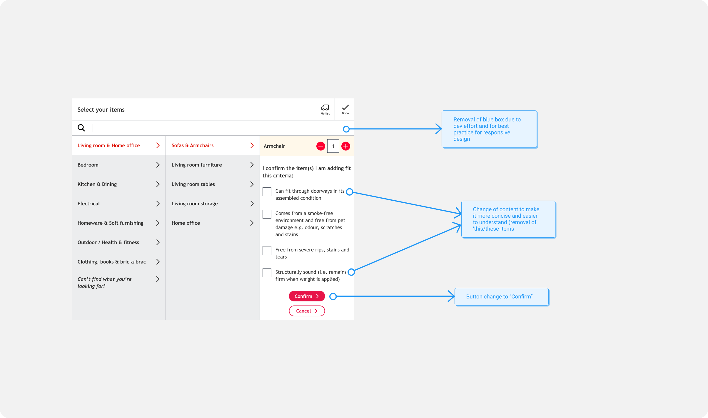
Design changes
Design changes
After further collaboration with content designers and developers, a few further changes were suggested to improve the design further.
After further collaboration with content designers and developers, a few further changes were suggested to improve the design further.
Further design changes
Deliver
Deliver
This’ll be where ‘handover’ occurs, although with this project there wasn’t a cut and dry handover as there was a lot of back and forth. New requirements needed to be added for different items, developers had spotted edge cases and content designers improved content.
I liked this because creating a solid user experience really is a team effort!
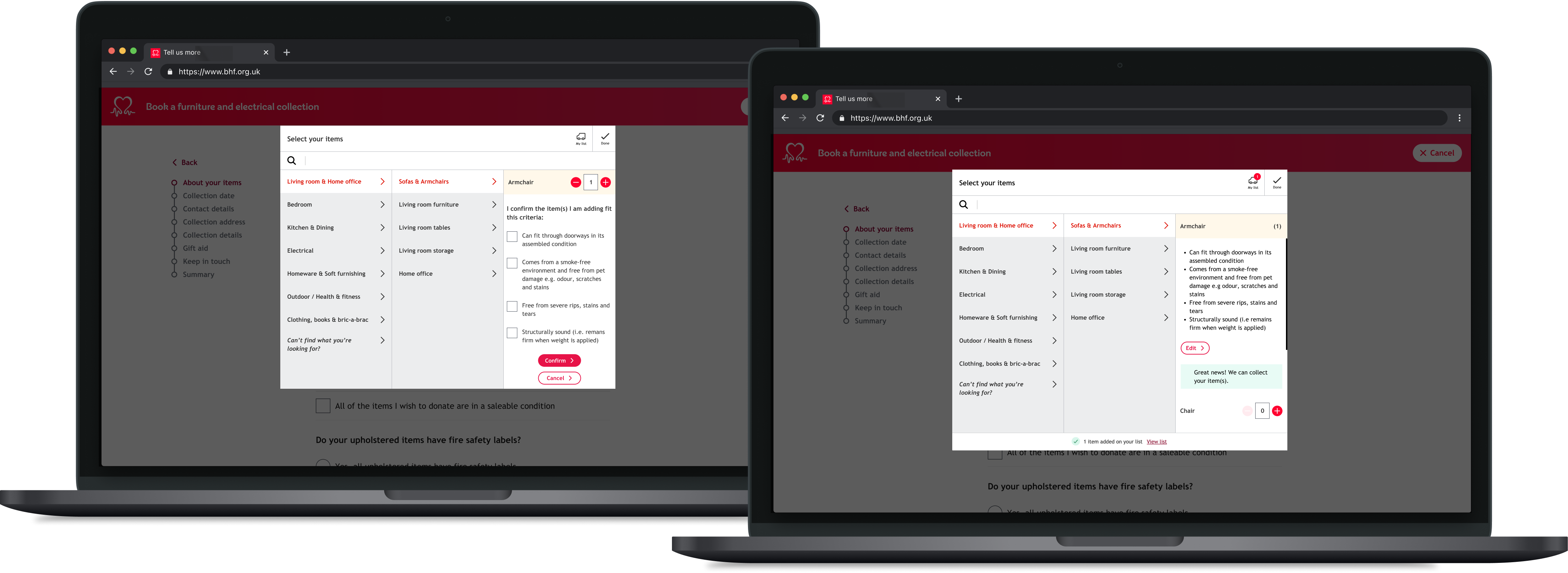
Final designs
Final designs
These are the final designs! Multiple items had validation questions, so I’ll show the designs for what armchair validation questions will look like and include a further prototype for what a coffee table will look like. Et Voila.
These are the final designs! Multiple items had validation questions, so I’ll show the designs for what armchair validation questions will look like and include a further prototype for what a coffee table will look like. Et Voila.
The desktop designs of the item validation process
The desktop designs of the item validation process
My learnings from this project is that, handovers should involve a lot of communication between designers and developers. Both parties benefit a lot from collaboration and filling in the gaps to result in the best user experience.
I also learnt that the key to crafting solid user experiences is testing small and often. I was able to make a key change (changing the button copy). The previous button copy would have probably caused a lot of confusion, so it was a key thing to change.
Position
UX Designer
Tools
Miro, Figma
Timeline
6 months
Team
Product design lead, product manager, scrum team incl. QA, back-end development, front-end development, business analyst & myself
Position
UX Designer
Tools
Miro, Figma
Timeline
6 months
Team
Product design lead, product manager, scrum team incl. QA, back-end development, front-end development, business analyst & myself