British Heart Foundation
British Heart Foundation
Streamlining the process to effortlessly schedule preferred date and time for exclusive online donations collection service, eliminating the need for confirmation calls.
Streamlining the process to effortlessly schedule preferred date and time for exclusive online donations collection service, eliminating the need for confirmation calls.

The challenge
The challenge
When you have high-quality things at home that you no longer need or are moving, and you don’t want to toss them in the dump, you’ve got several alternatives.
You can give it to a friend, sell the item or you can donate them.
British Heart Foundation supports you with the last option. However, the process can be a little bit frustrating because the service can be booked online but the store has to call donors to confirm the time slots selected.
This can mean donors often don’t get the dates they picked when they were booking the service online. Which has definitely led to a less than ideal donor experience.
This project aims to implement an online booking function that allows donors to book a selected date and time that requires no confirmation from customer assistants on the phone.
This project aims to implement an online booking function that allows donors to book a selected date and time that requires no confirmation from customer assistants on the phone.
Design process
Design process
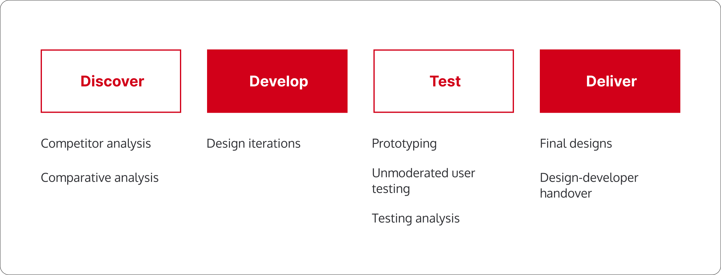
Choosing a design process isn’t a one and done thing, and every project deserves its own one. As this project was focusing on creating UI as the problem space was already defined, this is the bespoke process I followed.
Choosing a design process isn’t a one and done thing, and every project deserves its own one. As this project was focusing on creating UI as the problem space was already defined, this is the bespoke process I followed.

Discovery
Discovery
Donors have been expressing concerns to store managers about the limited collection slots for this service, leading to unmet expectations.
In my exploration, I delved into how various organizations handle collection dates and time slots, examining both similar and different services to find some promising solutions.
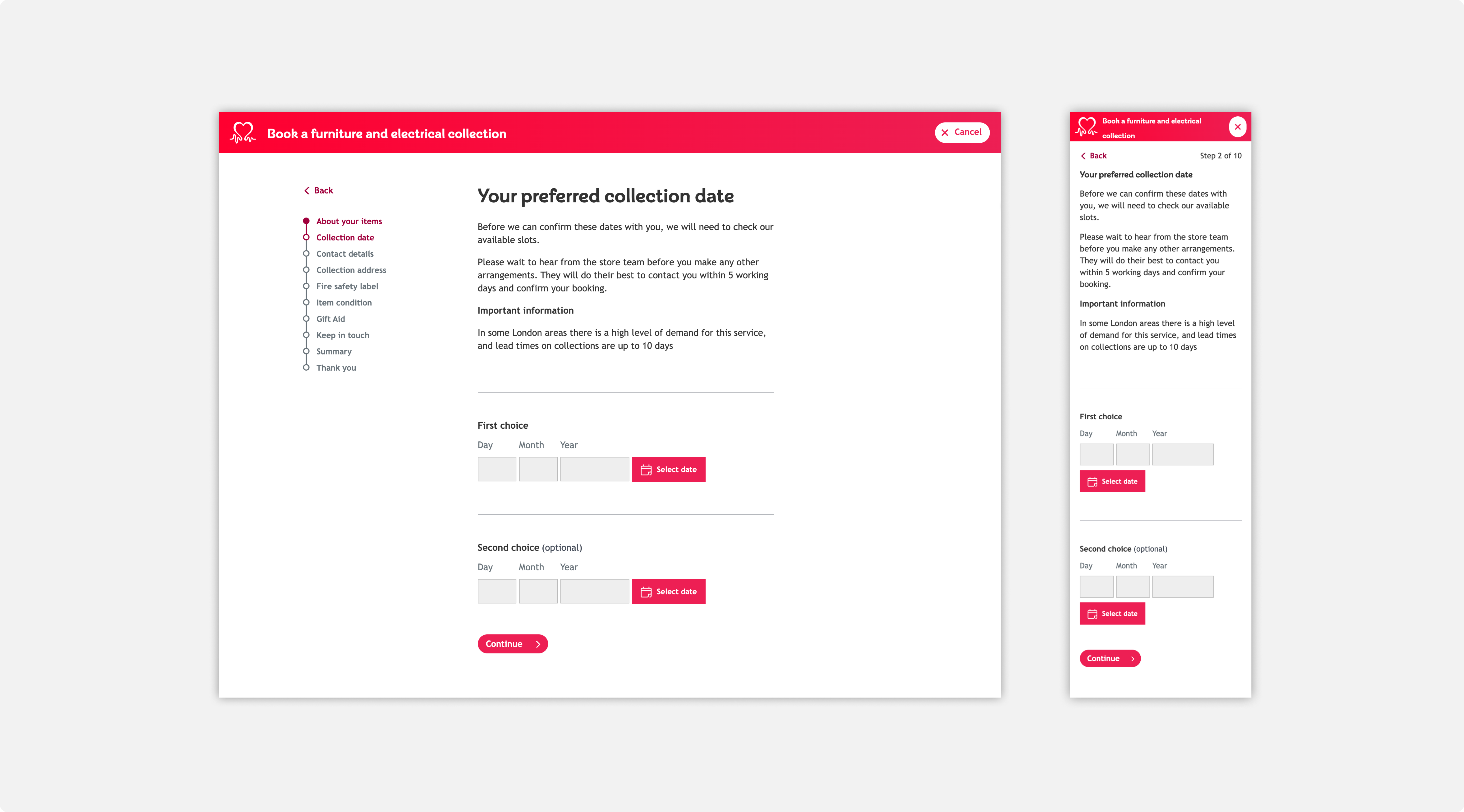
But before I get into that, I’ll show the current design. This current design presents users with ‘preferred’ collection dates. The backend hasn’t yet been developed to support designated time and collection slots that users can expect the service collection, not preferred.
Due to backend systems being explored that would lead to this feature being able to appear on the form, this project was able to take place.
I’ll present the design to give context to the page and within the system I have worked in.
Competitive and Comparative Analysis
Competitive and Comparative Analysis
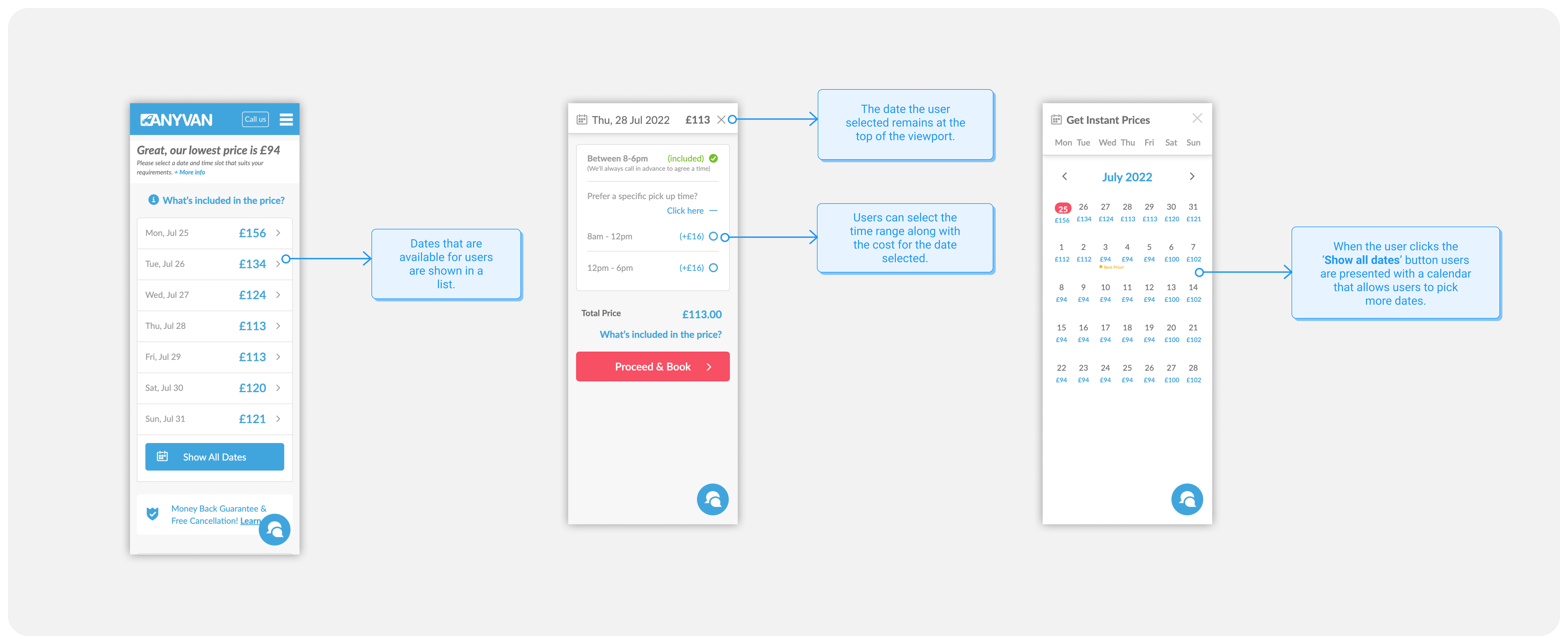
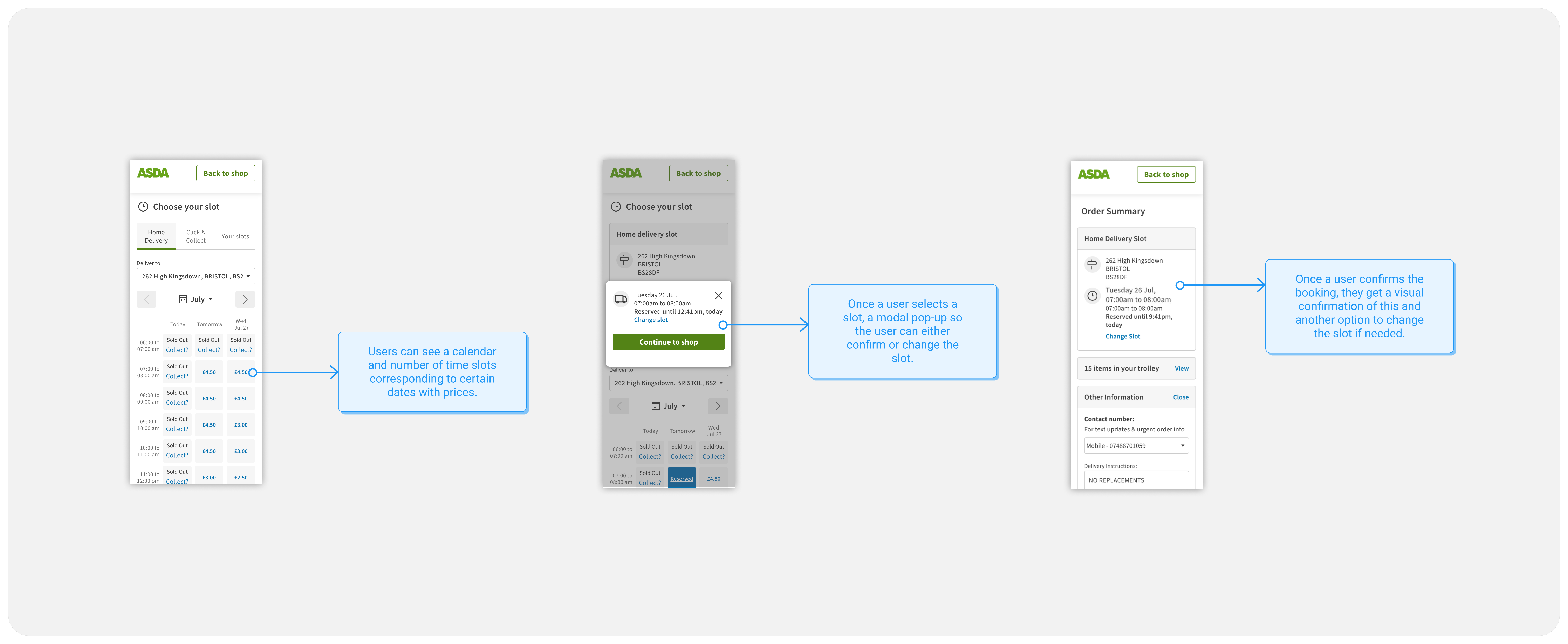
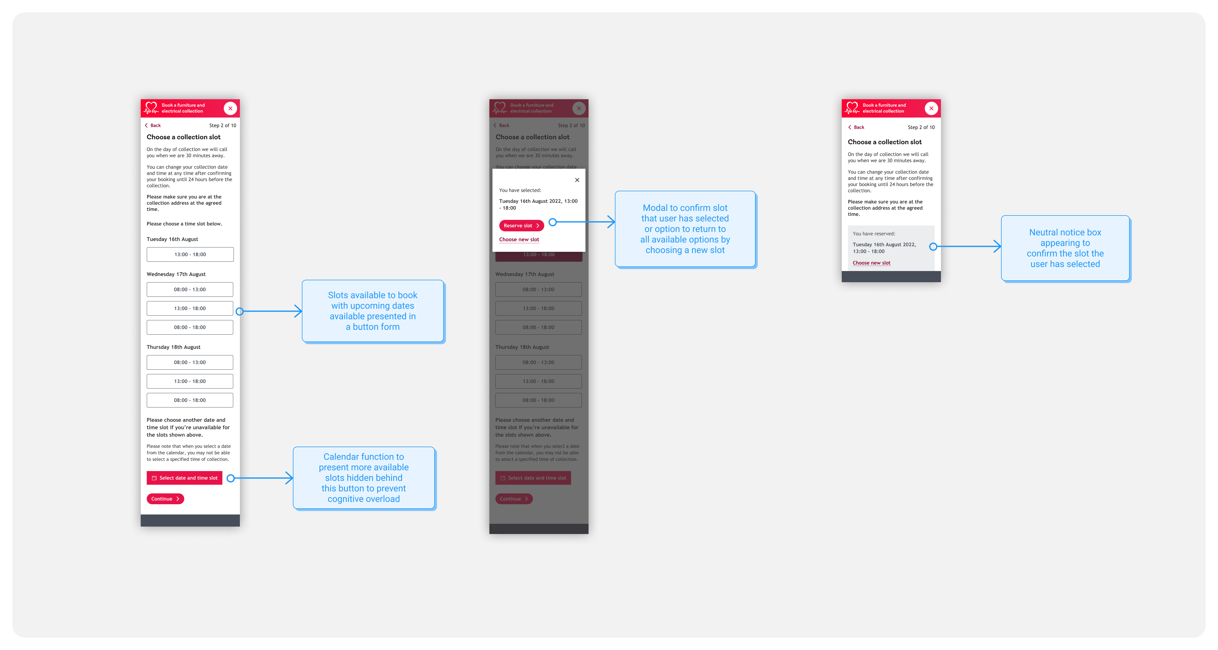
When carrying out the competitive analysis, I looked to organisations offering a very similar service like AnyVan and SueRyder.
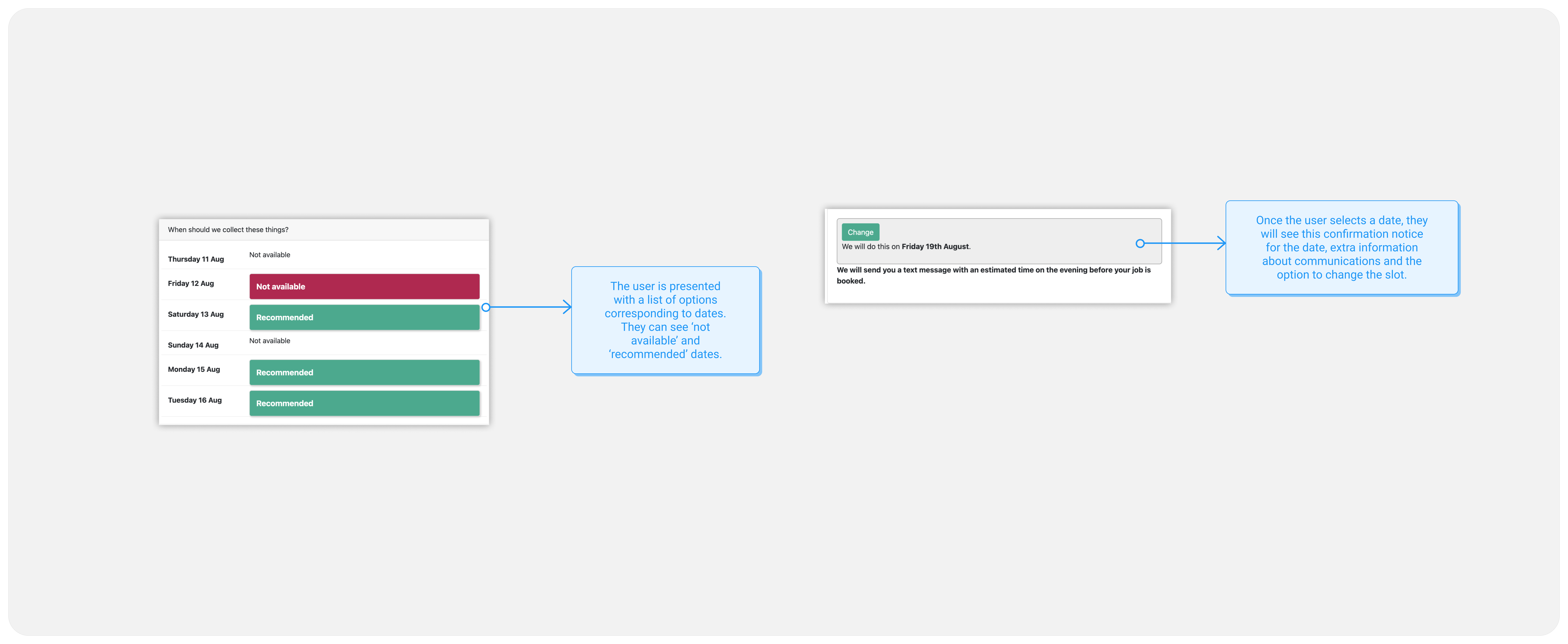
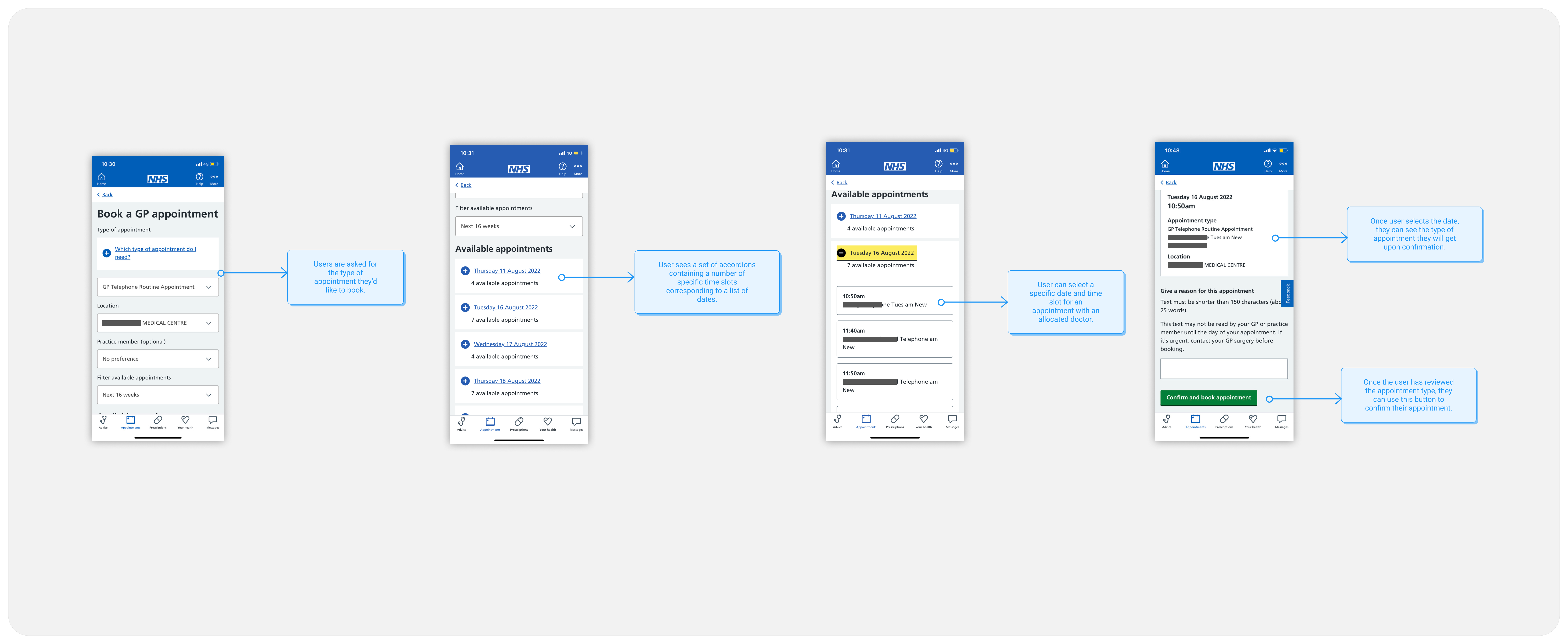
I also explored organisations that are well regarded by the public such as Asda and the NHS. Both organisations provide services that support people booking deliveries or appointments online.
Develop
Develop
Now…this is a part of design that I used to struggle with, but I’ve grown to thoroughly enjoying it now.
This is the part where I create loads of ‘messy’ designs in Figma and choose one ‘star’ to test.
Here are some of the ideations I’ll share…
Now…this is a part of design that I used to struggle with, but I’ve grown to thoroughly enjoying it now.
This is the part where I create loads of ‘messy’ designs in Figma and choose one ‘star’ to test.
Here are some of the ideations I’ll share…
Ideation 1
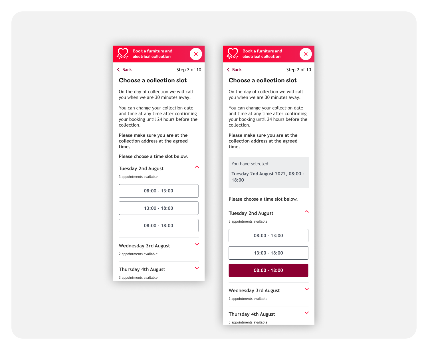
Ideation 2
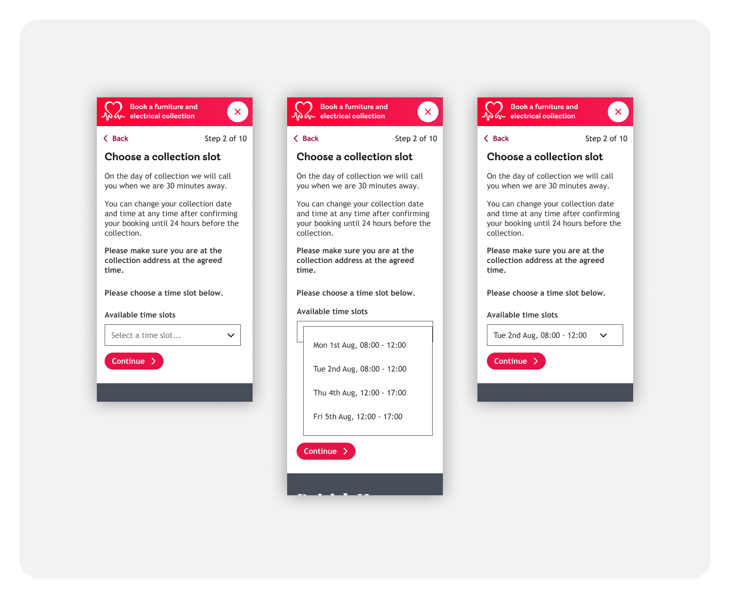
Ideation 1

Ideation 2

Chosen design to test
Chosen design to test
I went to the drawing board (artboard) and did some more iterations before arriving at the iteration below.
I requested feedback from other designers and did some guerilla testing before arriving at the design solution I wanted to test.
I went to the drawing board (artboard) and did some more iterations before arriving at the iteration below.
I requested feedback from other designers and did some guerilla testing before arriving at the design solution I wanted to test.
Ideation 3
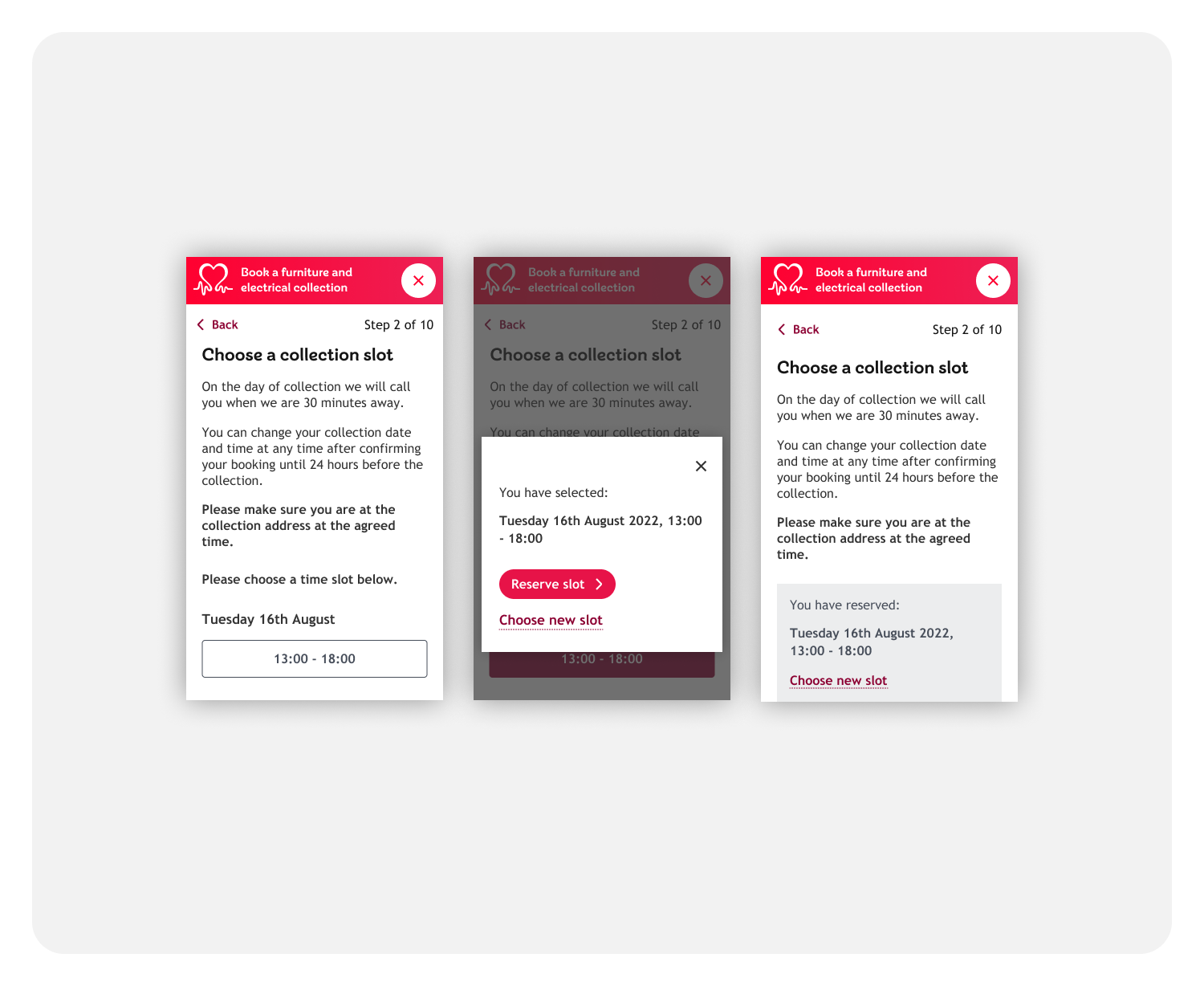

Test
Test
So, the prototype ready to go and it was time to put it to the test with some users. I went for unmoderated user testing — using Useberry. Useberry’s platform is great for garnering quick user feedback.
The prototype was ‘straightforward’ with only one route and one final screen therefore not much context was needed. That’s why I chose to do unmoderated user testing.
Please note: the test was performed using desktop designs.
Unmoderated user testing
Unmoderated user testing
The test’s main purpose was to discover whether people could understand the content, use it to reach the final stage – successfully make a booking.
The test’s main purpose was to discover whether people could understand the content, use it to reach the final stage – successfully make a booking.
The test was shown to 42 people.
- 17 users didn’t engage with the task at all
- 10 users dropped off but made at least one click before doing so
- 15 users completed the task successfully
The test was shown to 42 people.
- 17 users didn’t engage with the task at all
- 10 users dropped off but made at least one click before doing so
- 15 users completed the task successfully
Testing analysis
Testing analysis
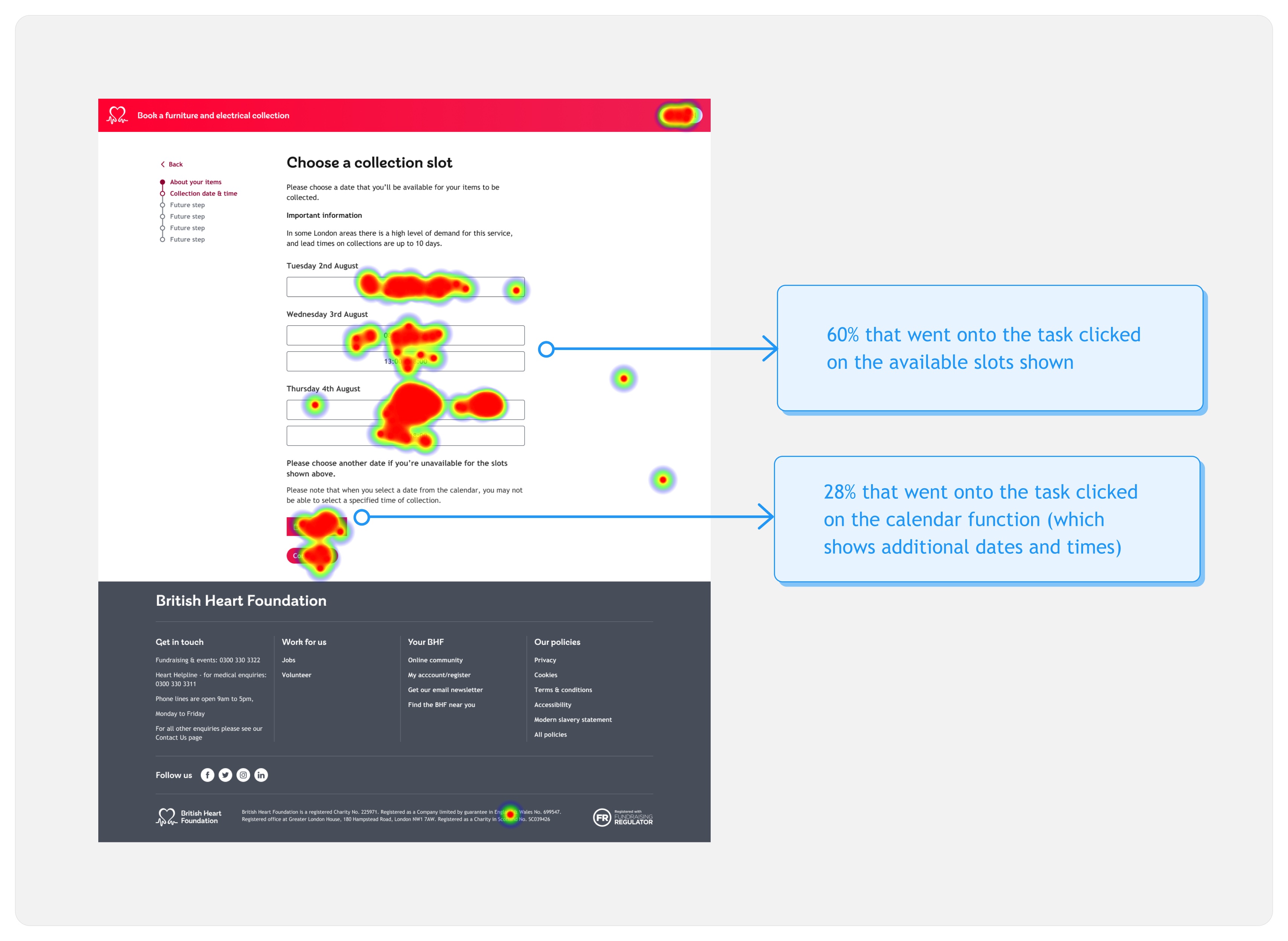
Following the unmoderated testing, I took a look at the user feedback and data provided by Useberry. Here are some of the insights!
Heatmap
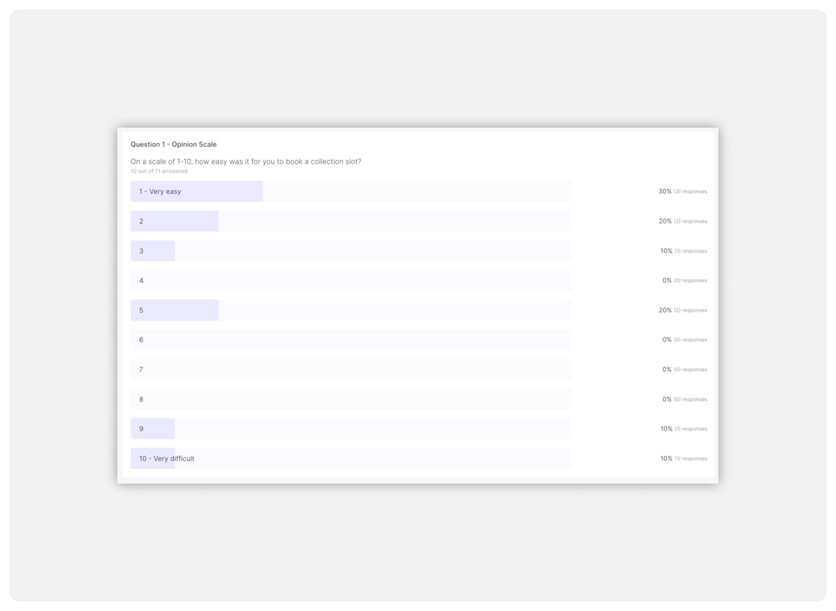
Difficulty rating
Heatmap

Difficulty rating

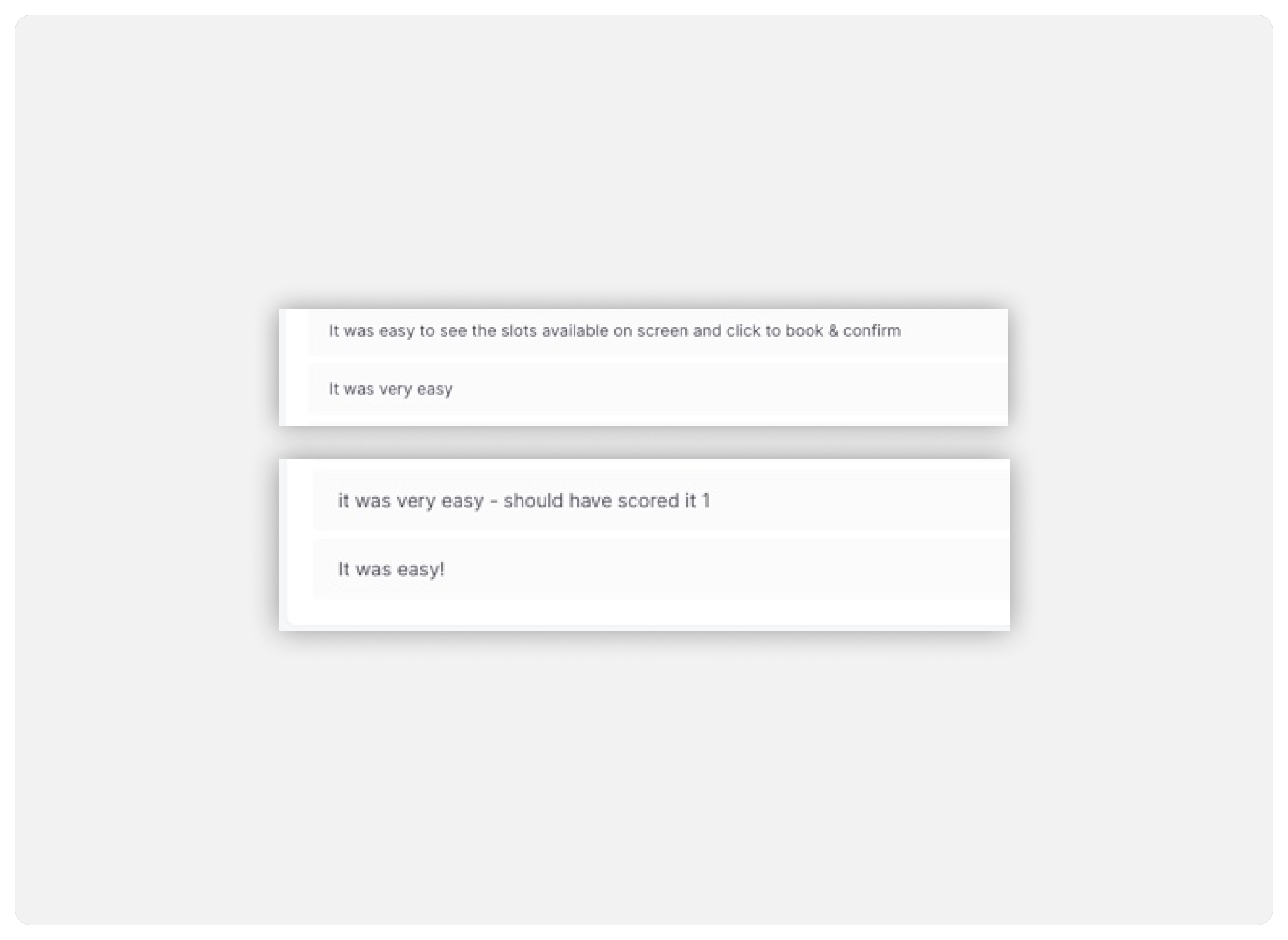
Positive feedback
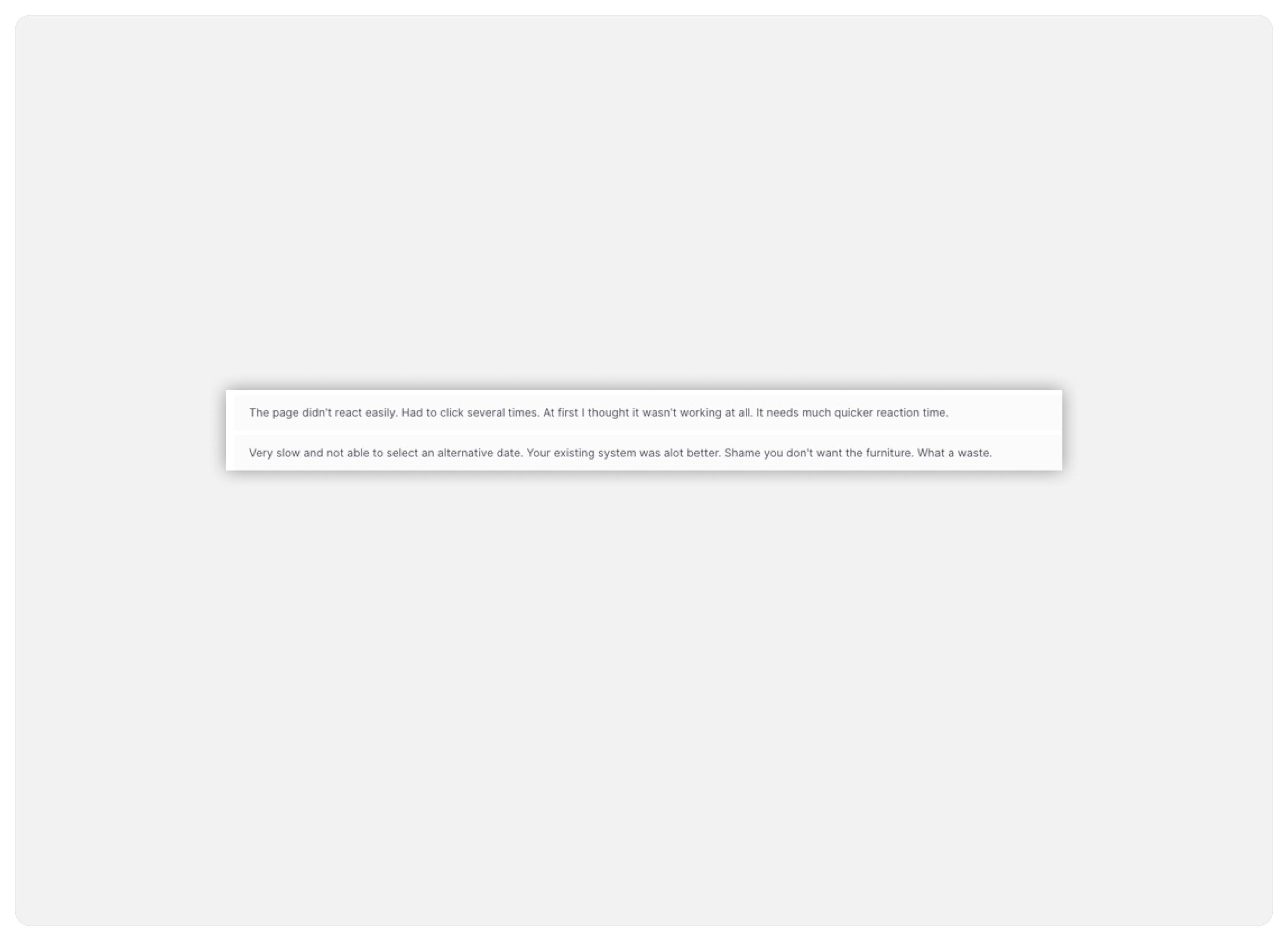
Not so positive feedback
Positive feedback

Not so positive feedback...

Deliver
Based on the nature of the comments and the results collected…The final design didn’t differ from the one that was tested.
The majority of users found the prototype ‘easy’ to use and the comments that showed some not so positive feedback related to the prototype itself and not the interaction, copy or buttons used to make the booking.
If all the slot bookings available were prototyped, I’m confident that these comments wouldn’t have appeared.
Final designs
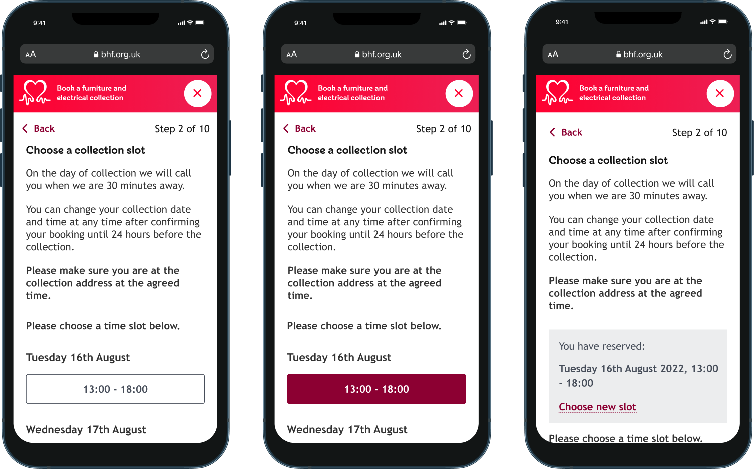
These are the final designs for the slot booking of donations collection service.
Final designs
These are the final designs for the slot booking of donations collection service.
Key takeaways
Until backend systems are fully in place, designs cannot yet be deployed. However, once the designs are implemented one of the key pieces of feedback to look at will be less complaints to customer service about expectations of booking appointments not being met.
Key takeaways
Until backend systems are fully in place, designs cannot yet be deployed. However, once the designs are implemented one of the key pieces of feedback to look at will be less complaints to customer service about expectations of booking appointments not being met.
My learnings
I really enjoyed working on this project because I got to test out new usability testing software. I also got to meet with a store manager that gets to interact with customers to see how they feel about the service and to get some pointers for things they’d appreciate.
My learnings
I really enjoyed working on this project because I got to test out new usability testing software. I also got to meet with a store manager that gets to interact with customers to see how they feel about the service and to get some pointers for things they’d appreciate.
-
Position
UX Designer
-
Tools
Miro, Figma
-
Timeline
6 months
-
Team
Product design lead, product manager, scrum team incl. QA, back-end development, front-end development, business analyst & myself
-
Position
UX Designer
-
Tools
Miro, Figma, Useberry
-
Timeline
3 months
-
Team
Product design lead, product manager, scrum team incl. QA, back-end, front-end and business analyst
-
Position
UX Designer
-
Tools
Miro, Figma
-
Timeline
6 months
-
Team
Product design lead, product manager, scrum team incl. QA, back-end development, front-end development, business analyst & myself
